
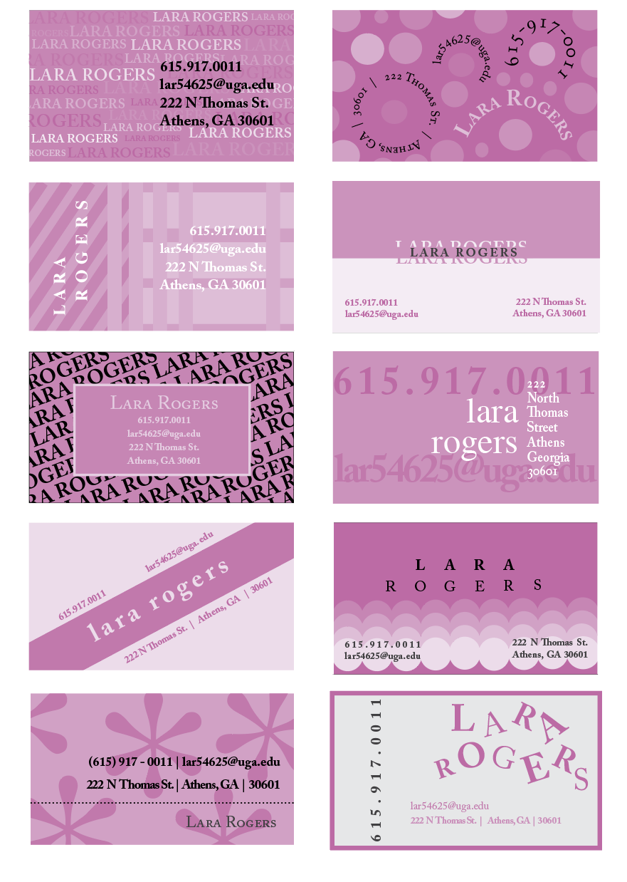
In my Typography class, I was tasked with designing 10 completely different business cards, each uniquely showcasing typography as the primary visual element. The other catch was we could only use one type family and main color at different hue levels.
This project was executed in Adobe InDesign and challenged me to think critically about font choice, hierarchy, spacing, and overall composition. By exploring a variety of design styles and industries, I gained a deeper understanding of how type can communicate brand personality and tone without relying on imagery. It was a great exercise in both creative expression and technical precision.